Identity that grows with you

Turning abstract identity into something visible, motivating, and worth proving in the Web3 space.

MocaProof key visual
Overview
MocaProof is Moca Network's GTM product for digital identity on Web3. A credential verification platform where users build a verifiable on-chain reputation, and partners reach high-intent, bot-resistant users.
My role
Sole Product Designer, end-to-end
Team
PM × 2FE × 2BE × 2BrandMe
Timeline
Jun to Nov 2025, 6 months from design to launch
Credentials verified
51K+
During beta launch on Moca Chain testnet, across 45 credential proofs.
Credential partners
15+
Onboarded across four categories: influence, finance, loyalty, and activity.
Partner reward pools
~$87K
Committed across 8 campaigns by Nansen, Ethos Network, Pieverse, and Brett, validating MocaProof as a trusted acquisition channel.

Your digital identity is fragmented, and none of it is truly yours.

Loyalty history, social reputation, and financial credentials are scattered across platforms that don't talk to each other. Moca Network was built to change that. Our vision is to unify identity as one layer where everything you've done, everywhere you've been, and everything you've earned comes together in one place, owned by you and verifiable by anyone. MocaProof is positioned as the GTM product to bring that vision to life.

Moca Network unified identity vision

How do you make identity feel meaningful, not mechanical?

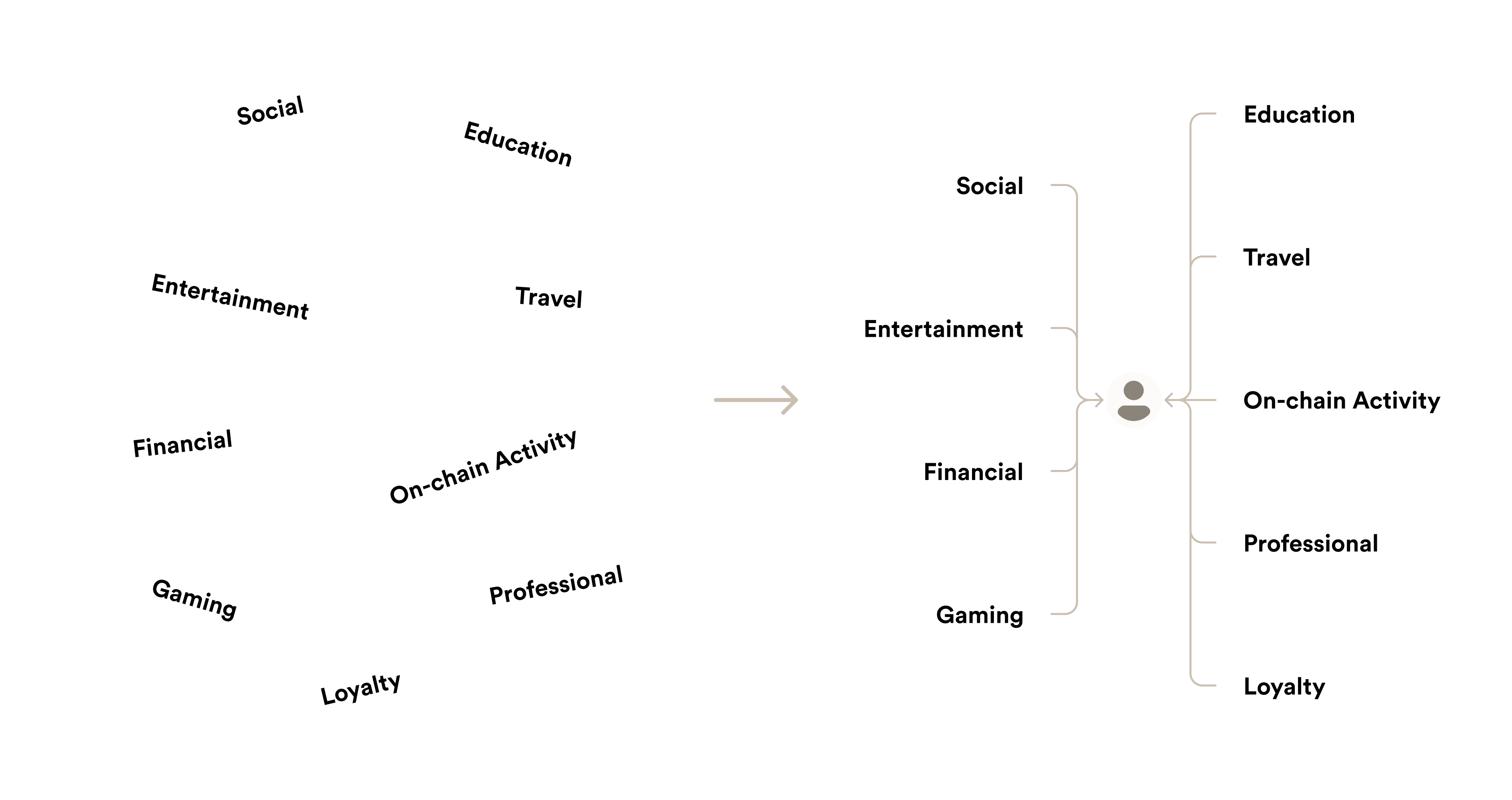
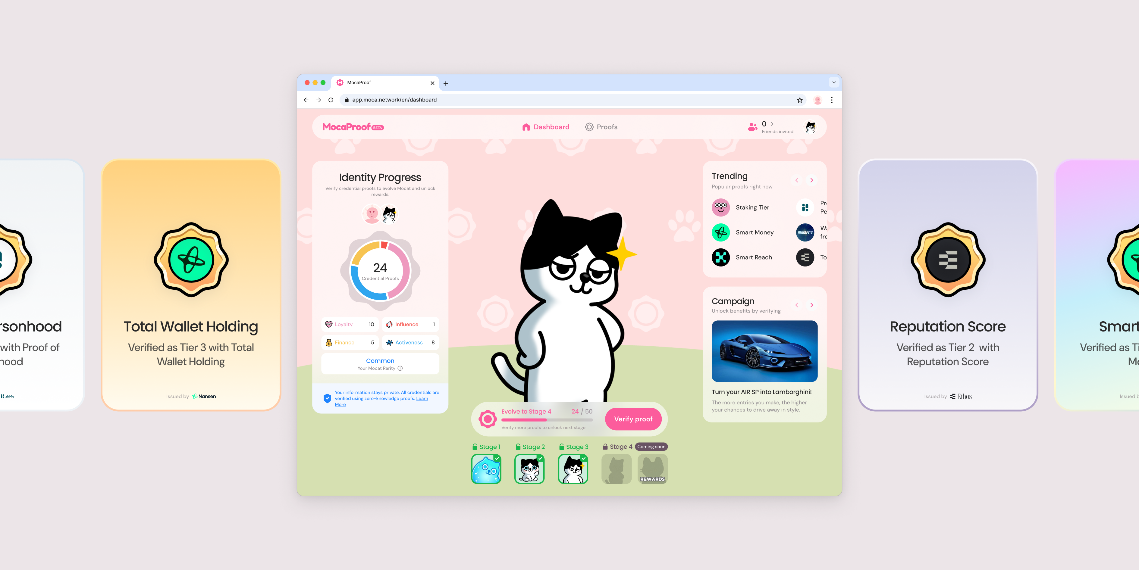
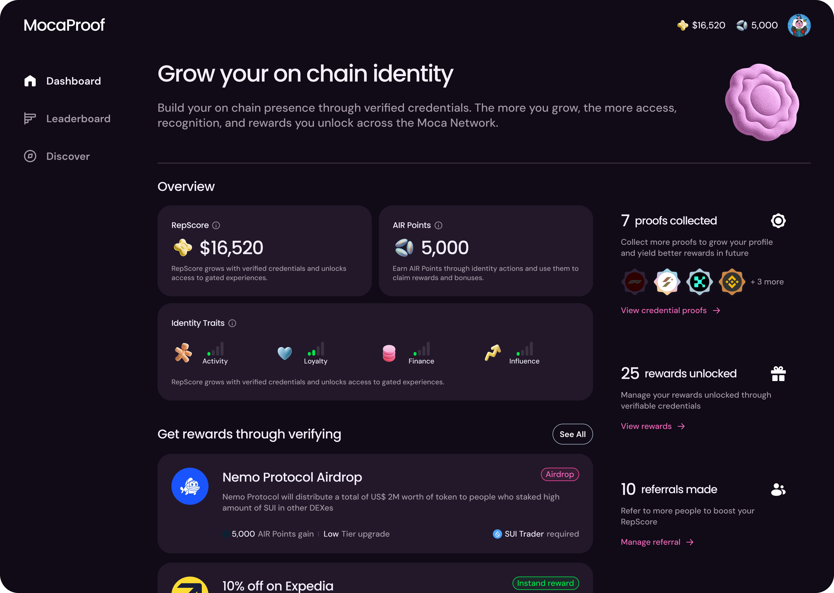
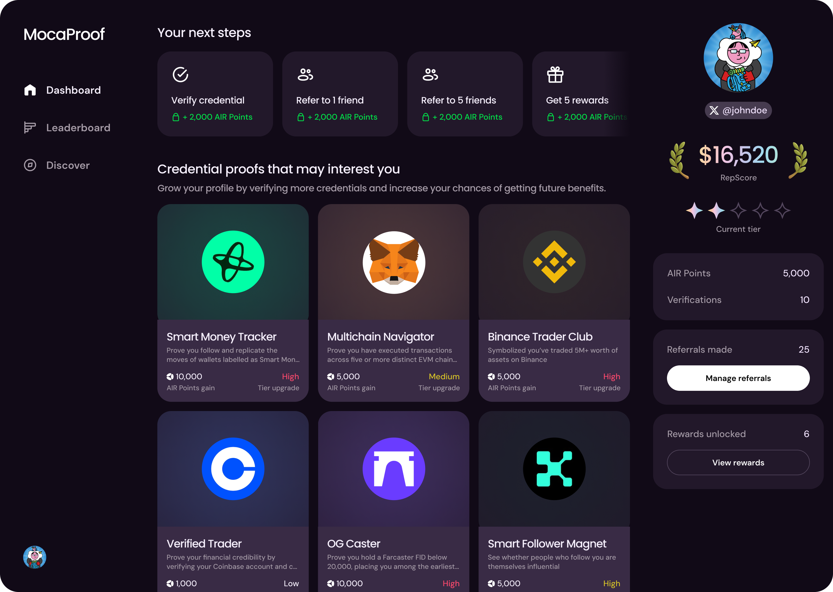
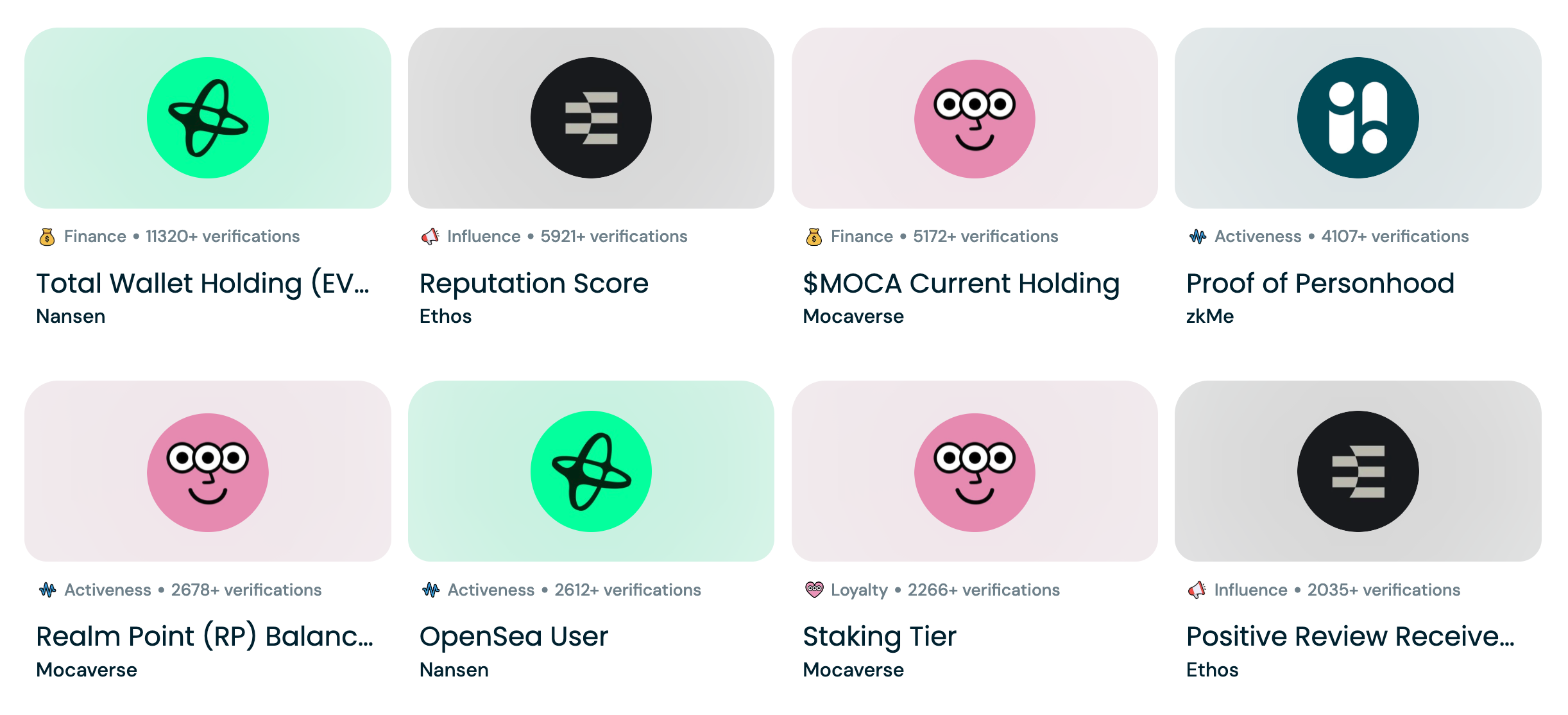
Credentials were organised into four categories, Activeness, Loyalty, Influence, and Finance, and the more users verified, the higher their rank. Underneath, it was a point system.

Design kicked off with a partial brief, including some unresolved product mechanics like how points would be calculated.

Tension 01
A task list would work, but reduces identity to a grind
Verify this and earn that mechanics would ship, but they strip identity of meaning. MocaProof needed to feel like a reflection of who you are, not a checklist.
Tension 02
Surface the score and users ask how it's calculated
The point formula wasn't something we could fully disclose. Any visible number would invite questions we couldn't answer.
Tension 03
Hide the number and motivation disappears
Without a visible signal of progress, users lose the reason to keep engaging. We needed legibility without transparency.

Four directions, each building on what the previous one revealed

With no precedent for what a digital identity platform should look and feel like, the early design phase was an open exploration. Showing concrete options became the alignment tool when the brief was vague.

1

Dashboard

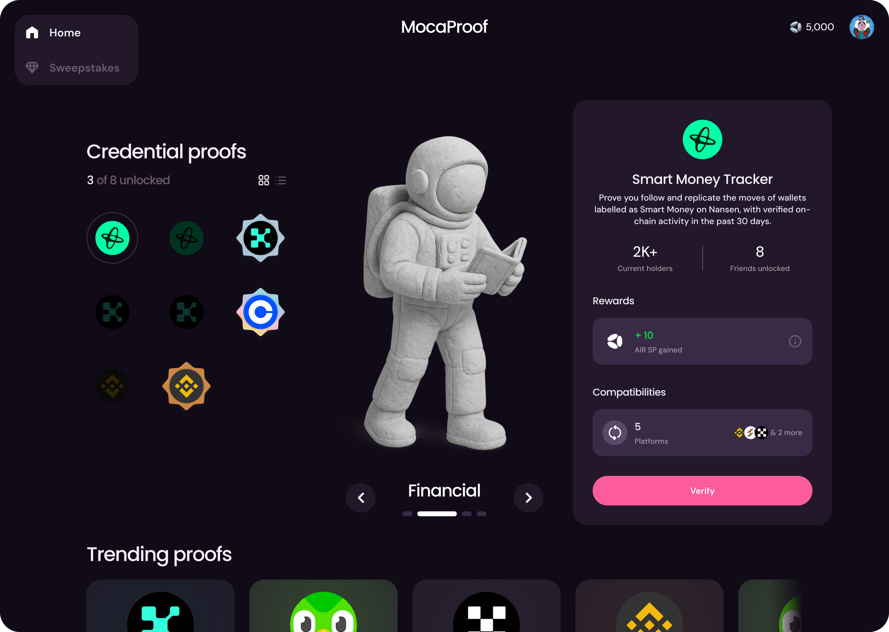
A structured view of credential categories and accumulated points. Clear and organised, but felt closer to a report than an experience.

Direction 1: Dashboard exploration
2

Bounty Board

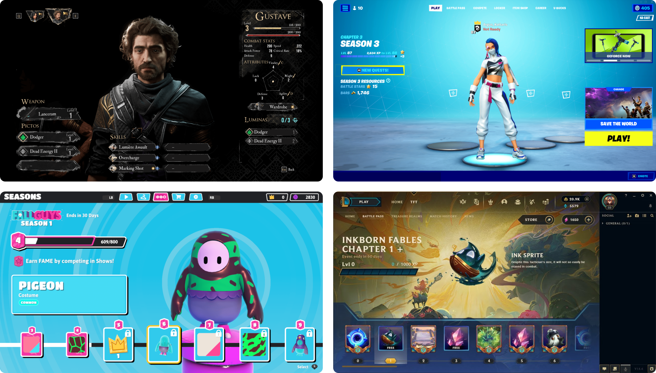
A quest-like interface where users browse and pick verifications to complete. More energetic, but the interaction was gamified without the identity being so.

Direction 2: Bounty Board exploration
3

Gamification

Each verification became a star. Users collected dots and drew their own constellation. Identity becomes something you map and own, unique to you. This was the first direction that felt personal, but the build cost was too high.

Direction 3: Gamification exploration

What if your identity page felt less like a product screen and more like a character sheet from an RPG? Credential categories became stats. Verifications became achievements to unlock.

Gaming screens that shaped Direction 4
4

RPG Character Profile

The shift came when the team stopped thinking in terms of dashboards and started thinking in terms of characters. What if your identity page felt less like a product screen and more like a character sheet from an RPG? Credential categories became stats. Verifications became achievements to unlock. The profile itself became a character that visibly levels up over time.

Direction 4: RPG Character Profile

Mocat at the centre of the experience

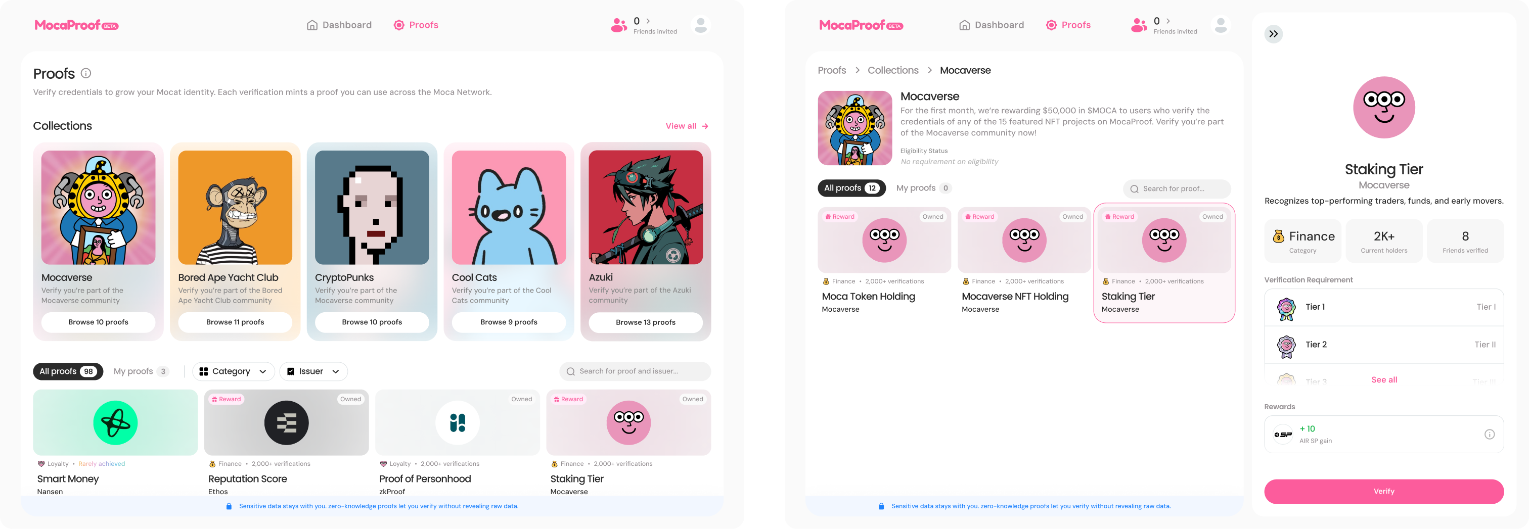
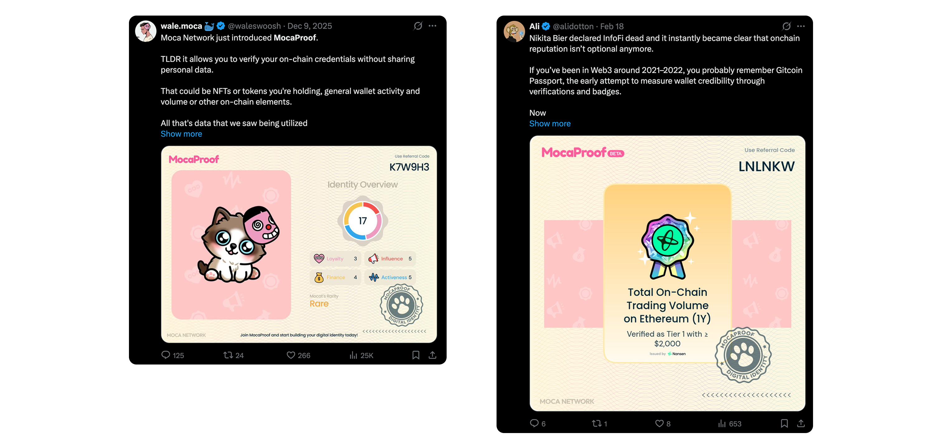
The final design placed Mocat, a virtual companion already beloved in the Mocaverse community, as the character at the centre of the profile. Rather than leading with a score or a task list, the profile opened with your Mocat, a living representation of your verified identity that evolved through tiers as you proved more about yourself.

Mocat at the centre of the profile

The profile opens with your Mocat, a living representation of your verified identity that evolves through tiers as you prove more about yourself.

Mocat profile with evolving identity

Four credential categories

Credentials were organised across influence, finance, loyalty, and activity. Completing verifications unlocked badges on your profile and exclusive access to partner perks.

Credential marketplace across four categories

Progression without exposing the formula

Mocat's visible evolution gave users a sense of progression without exposing the underlying point calculation.

Mocat evolution through credential tiersMocat evolution through credential tiers

Social sharing closes the loop

Users could share their Mocat's current form or credential tiers, turning identity into something worth showing off without needing a leaderboard.

Social sharing of Mocat and credential tiers

What happened after we shipped

MocaProof launched in beta on Moca Chain Testnet in December 2025. Since launch, the platform has accumulated over 51,000 verifications across 45 credential proofs.

51K+ credential verifications during beta, across 45 credential proofs on Moca Chain testnet.
15+ credential partners onboarded across influence, finance, loyalty, and activity.
Users began sharing Mocat profiles and credential tiers organically on X, validating social sharing as a driver of visibility and engagement.
8 partner campaigns launched in the first 4 months of beta with ~$87K in reward pools committed, including Nansen, Ethos Network, Pieverse, and Brett.
Top verifications on MocaProofUsers sharing Mocat profiles on X

What I'd take into the next project

Tight timelines and shifting directions don't have to stall progress. When the path forward isn't clear, design can be the thing that creates momentum, giving the team something concrete to rally around and refine together.

What worked
  • Designing multiple concepts became the alignment tool. When the brief is vague, showing concrete options gets a team to consensus faster than any discussion.
  • Shifting to a character framework resolved the three tensions at once. Mocat gave identity structure, motivation, and personal meaning in a single move.
  • Social sharing closed the loop without a leaderboard. Users got to show off progress without us needing to publish rankings or calculations.
What I'd do differently
  • I'd help the team define more concrete success metrics. Without them, every design review became a matter of taste.
  • This was my first time designing something that felt like a game. Coming from fintech products that lean cold and functional, MocaProof pushed me to think about emotion and progression as design tools.