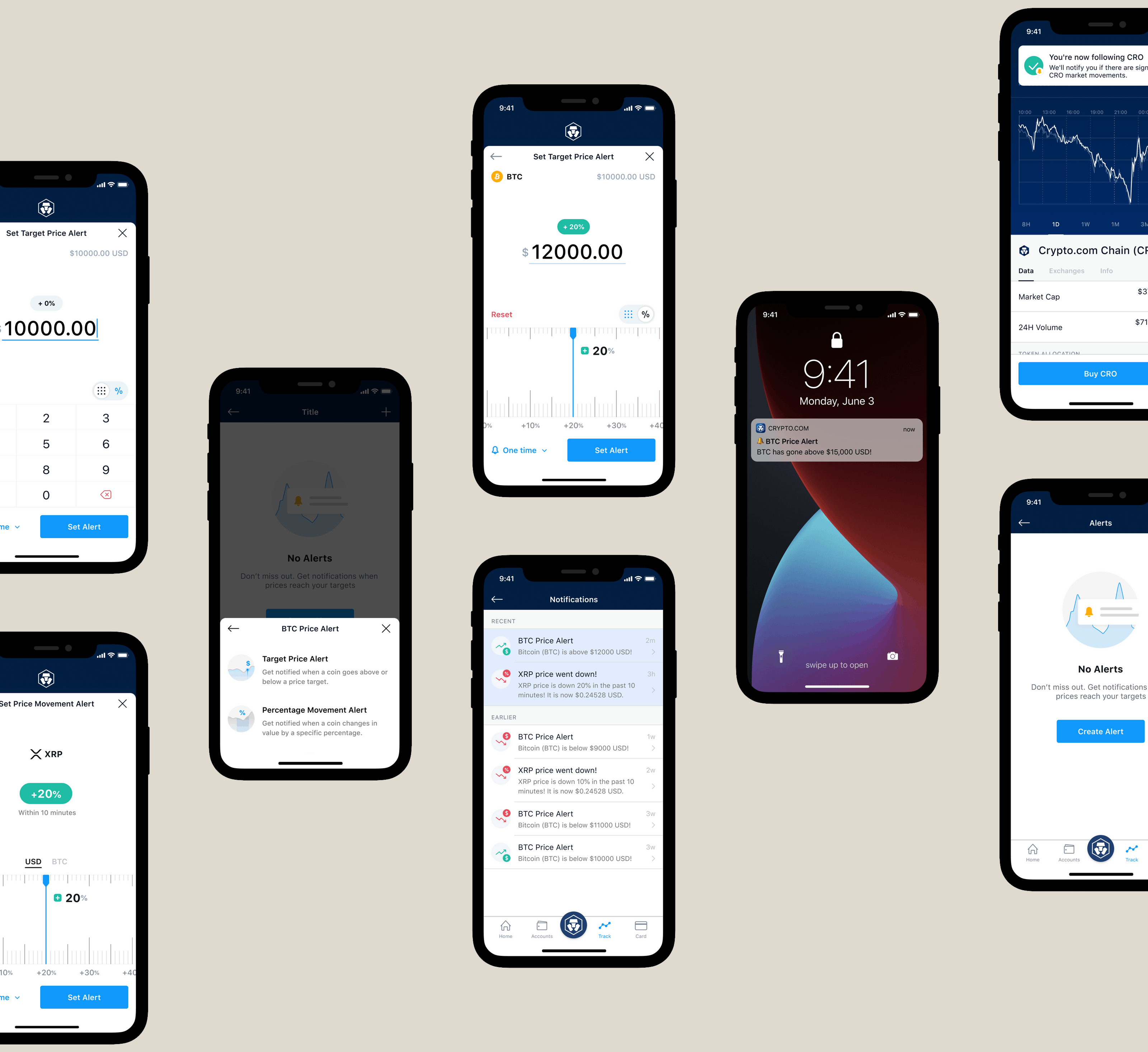
Before I join Crypto.com, my experience was more towards B2B web products. Joining a B2C product company that serving 1 million users (in 2019) was a new challenge for me. It took me some time to switch my sense from designing for B2B to B2C products. This is the first project that granted me confidence and enlightened me to approach design in Crypto.com.
Ideation
Informed by the user problem, we came up with these 3 ideas to address it.
User Defined Price Alert
Users buy or sell cryptocurrency when the price reaches a target. We want users to be able to set a target and get notified when the condition is met. It could be above/below a certain price, or, up/down by a certain percentage
Automated Market Movement Alert
While it's good to let users set a target and be notified, some users may not have ideas on how to define a target. They could be new to the market or there is a new project where historical data isn't there for any price predictions. In these scenarios, we want to notify users when there is a significant market movement over a rolling period time. People can get a sense of what's going on in the market without actively setting specific targets to get notified
Notification Centre
Push notifications can be easily ignored or dismissed. Moreover, users might even turn off the push notifications. We realized the need to have a place where users can view all the notifications received and bring users to take action
Early Concepts
Below are some of the drafts during exploration stage:

I have 3 realizations while doing the drafts for this key flow:
- Need a place to centralize the alert settings so users can create and manage their alerts there
- There are two criteria when setting an alert - which cryptocurrency is the target and what kind of alert it should be. More importantly, how to explain the difference between Target Price and Price Change alert is the key
- The way to input could be something to explore. For example, cryptocurrencies' unit price in USD could be ranged from 5 digits to 6 decimal places. How can I make it less painful when users modifying a long number?

There are 3 things to consider when doing this screen:
- Since users are setting a future price, the current price should be needed as a reference. A percentage change indicator could be handy for users to make sense of price differences
- As mentioned before, relying solely on Numpad for input could be painful if the number is long. To emulate the sense of adjusting a number up or down, would this physical interaction like measuring tape helps to ease the pain of input?
- Notification is useful, but annoying at the same time. Allowing users to set the frequency of getting this alert is a key


